The most trendy colors of Fall-Winter 2018/19 according to PANTONE
- 15 Aug, 2018
- LT world

The colors of fashion in this upcoming fall-winter season have the clear purpose of expressing our individuality, ingenuity and creativity through the garments and the chromatic combinations that we can make with our clothes, accessories and shoes.
Each new season, Pantone presents us with the most relevant color trends in the world of fashion. This time we look at the Fashion Color Trend Report Fall/Winter 2018, in which we show a selection of the most trendy colors for the next season of Fall-Winter 2018. To make this study, Pantone analyzes the proposals of designers who parade at New York Fashion Week and at London Fashion Week, the result is a report with 12 fashion colors. During the next months, the tonalities that will mark the fashion trends have a certain declaration of intentions, reflecting a generalized feeling, together with a specific season.
Pantone represents a whole display of classic tones, which are complemented by much more creative and expressive colors. All of them conceived from a chromatic palette with daring nuances and filled with energy that are not usually typical for the cold season of the year.
This coming autumn-winter, the mix & match of materials and textures is added to the use of new and unexpected colors and tones for the winter season, in this way it is intended to reinvent the use of color by inciting us to leave aside the typical conventions. In fact, observing the Autumn-Winter 2018 color trends, there is an undeniable persistence of certain tonalities of the fashionable color palette in Spring-Summer 2018.
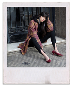
If you have decided to overturn your dressing room this coming autumn, the fashionable colors will undoubtedly be your best allies. All the fashionable colors of fall winter 2018 work by themselves, so to wear them in total look is perfectly viable and quite a hit, something we have already seen on the Fall-Winter 2018 catwalks, but the really charming thing is to play with them and decide to combine them.
In the following article we present the colors that will fill the shop windows and will become the new fav of your dressing this next season, will you accompany us?
Red Pear PANTONE 19-1536 # 7B3539
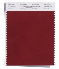
It is a very intense dark red tone, with shades of brown and burgundy. It reminds us to some extent to the color Marsala, a color that was the Pantone color of the year 2015 The Red Pear is a characteristic color of autumn, a warm and seductive tone that we will combine perfectly with earth and toasted tones. Recreating ourselves in other proposals of the Fashion Color Trend Report Fall / Winter 2018, creating a combination with the Ceylon Yellow can give a very autumnal and suggestive result, while combining it with the Mellow Rose we can achieve a delicate and elegant composition in equal parts. |
Valiant Poppy PANTONE 18-1549 # BC322C
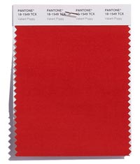
The Valiant Poppy is an intense red color, an extremely feminine and seductive tone. Much more daring than the intense Red Pear, but probably will be the color that we will carry this next season. Undoubtedly the ideal color for red stilettos. Combining this tonality seems very easy and extremely fun, since we can bet on giving a sober and sophisticated touch combining it with classic tones such as camel, brown and even white. Or opt for styles of strong visual impact, mixing in the same look colors like orange Russet Orange and Ultra Violet. |
Nebulas Blue PANTONE 18-4048 #2D62A3
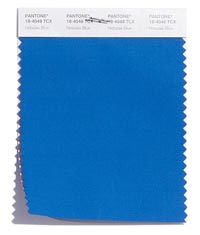
We are facing an intense blue, with nuances that invite us to relax and reflect. It is a tonality that makes us dream and reminds us of the color of the clean waters of deep seas. This is a color of strong Mediterranean inspiration that works great if we combine them with tonalities that remind us of the bright light of the sun by the sea, such as Ceylon Yellow or Limelight. |
Ceylon Yellow PANTONE 15-0850 #D4AE40
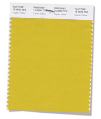
No doubt we find a perfect tonality to give light to the outfits of autumn-winter, a warm yellow that brings to mind spices such as curry and mustard. Combining the range of colors that goes from yellows to ochres seems to us a success both for casual looks, where they bring an exotic touch, as for more elegant outfits, where we want to put an original counterpoint. Bet on this color if you want to give your looks a bohemian and personal look. |
Martini Olive PANTONE 18-0625 #716A4D
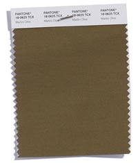
It is an olive green or military green very versatile, brings a sophisticated touch to the outfits and forms a counterpoint to the rest of the vivid colors present in the fashion palette for the next season Fall-Winter 2018 It is a very appropriate shade to wear in total look, also to wear combined with basic tones such as toasted, or black. But also with the yellow, pink, red and orange for the more daring. Risks with this tonality to get original looks, the chances of making mistakes are almost nil. |
Russet Orange PANTONE 16-1255 #E47127
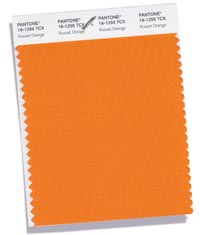
This orange reminiscent of earth tones, not only brings warmth, it also wastes vitality and energy, we are facing one of the most powerful colors in the fashion range for this season. Combined with the Ultra Violet, it embodies the perfect application of two chromatic opposites. Another composition of strong visual impact can be achieved by combining it with any of the red ones or with the Pink Pink Peacock. In any of the cases, it seems a complex but perfect tone to stand out. |
Ultra Violet PANTONE 18-3838 #5F4B8B
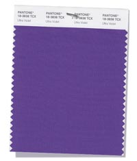
The Ultra Violet is a mystical and creative hue that represents the sum of opposite colors such as red and blue, we are facing the fashionable color of 2018, which seems almost identical to the Royal Lilac we had last winter among our colors of Headboard. Combine it with luminous tones like Ceylon Yellow to achieve incredible results or with shades of the same chromatic range as the Petal Crocus. |
Crocus Petal PANTONE 15-3520 #B99BC5
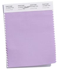
A violet hue, of clear spring inspiration that surprises us inside the selection of trend colors for autumn, providing lightness and a touch of freshness in the chromatic palette. We find it a perfect color for the transition from summer to winter, easy to combine with colors like Ultra Violet, red and even with Limelight. |
Limelight PANTONE 12-0740 #F0E87D
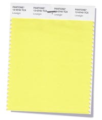
On this occasion we are faced with an effervescent yellow color that evokes the freshness of lemons. It is an ocher shade that unfolds perfectly with other colors of the color palette such as the Quetzal Green or the Olive Martini. We have no doubt that it is the perfect color to combine with the full range of green tones. Bet on her in your most relaxed outfits, it will be a guaranteed success. |
Quetzal Green PANTONE 18-5025 #006865
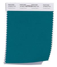
A deep green color with bluish tones, very elegant and sophisticated that recalls the rich plumage of the birds. We are convinced that this color will be a success if we combine it with Ceylon Yellow to compensate the intensity of yellow. We also find a perfect tonality with mixing with basic colors such as nude, gray or brown tones. |
Mellow Rose PANTONE 15-1515 #D9A6A1
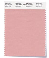
The Mellow Rose is a romantic and delicate shade of powdered rose, directly related to the color of fresh roses. We believe that it is a tone more in keeping with the spring that has crept into the winter trends. It can give a lot of play if we combine it with red, a mix that we have seen a lot during this spring-summer and that will have continuity in the next season. |
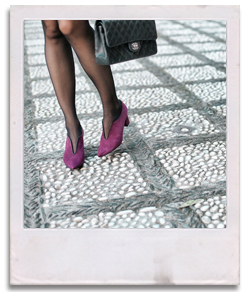
Pink Peacock PANTONE 18-2045 #C62168
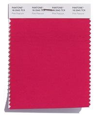
Again we have a color that follows the trail of fuchsia pink and bougainvillea color that we have seen so much this spring-summer season. Whether we opt for a total look, or if we combine it with other colors, the Pink Peacock allows us to create outfits with great visual impact. Combine it with blue, with red, or with a pastel pink hue, you create colorful and bold styles that turn out to be a success. |
In addition to these twelve colors, the Fashion Color Trend Report Fall / Winter 2018 proposes five more tones that work as basic. These will be the colors that we will use as a canvas on which to compose all our looks for the next season. These are classic colors, of which we all have a garment in our dressing room, such as dark blue, cream white, cream toasted, light gray and an ocher. All of them are the perfect basics to create discreet looks or to compensate for the risky nature of some of the colors of the fashionable color palette.
Tell us, what do you think about the proposals for next Fall-Winter?